What Is Responsive Web Design? A Complete Guide for Modern Websites
Sometimes people search on a phone while traveling. Other times, they open the same website on a laptop at work. Later, they might revisit it on a tablet at home. Throughout this journey, users expect the website to behave normally, load quickly, and feel easy to use every single time.
When that expectation is broken, trust disappears instantly.
This is exactly why responsive web design exists and why it has become one of the most important foundations of modern websites.
In this guide, our team at Web Development Company Ahmedabad shares practical insights from years of real work building, fixing, and improving websites across different industries. We have seen what truly works in real user situations and how small design choices can impact SEO, usability, and conversions.
So instead of theory or surface-level talk, this guide explains responsive web design in simple language, with clear steps and real examples based on everyday user problems.
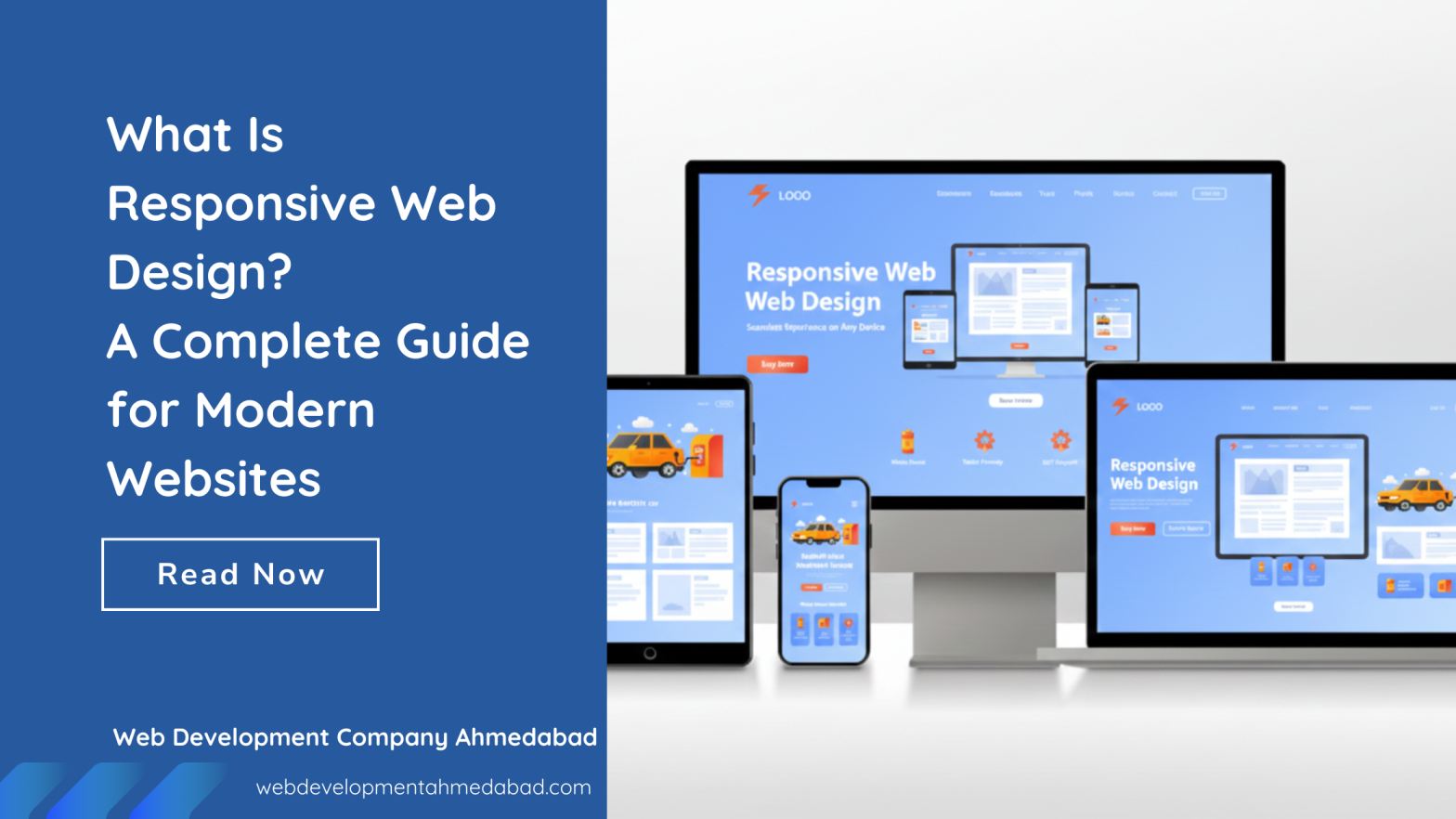
What Is Responsive Web Design in simple words?
In simple words, responsive web design means one website that works well on every device.
Responsive web design is all about creating a website that automatically adjusts itself according to the screen size and device being used. So whether someone opens the site on a mobile phone, tablet, laptop, or desktop, the website feels easy to read, easy to click, and easy to understand.
Because users behave this way, search engines also judge websites based on this experience. That’s why responsive web design is no longer optional. It is a basic requirement for modern websites.
You do not create a separate website for mobile and another for desktop. Instead, you build one website that changes its layout automatically. Text becomes readable, images resize properly, and navigation stays clear.
Responsive web design is not just about screens. It is about building websites that real people can use comfortably, trust easily, and return to confidently.
What Is the Purpose of Responsive Web Design?
 The main purpose of responsive web design is to make the user’s experience easy.
People today use different devices at different times. Sometimes they browse on mobile, sometimes on a laptop, and sometimes on a tablet. So if a website works well only on one device, it loses users on the others.
Responsive web design solves this problem by giving users the same smooth experience everywhere. At the same time, it helps businesses because managing one website is easier than managing multiple versions.
Search engines like Google also prefer responsive websites because they are easier to crawl, easier to index, and better for users. That’s why responsive design naturally supports SEO.
Benefits of Responsive Web Design
Responsive web design is not just about how a website looks. It directly affects how users behave, how search engines judge your site, and how often visitors turn into real customers. Below are the most important benefits, explained in a practical way.
Responsive Web Design Reduces Bounce Rate by Keeping Users Comfortable
When a website opens properly on any device, users feel relaxed. They do not need to zoom, scroll sideways, or struggle to click buttons. Because of that comfort, they stay longer and explore more pages.
On the other hand, if a website looks broken on mobile, users leave within seconds. This quick exit increases bounce rate and sends a negative signal to search engines.
So, responsive web design helps reduce bounce rate simply by making the website easy to use everywhere.
Responsive Web Design Delivers a Truly Mobile-Friendly Experience
A responsive website is not just “viewable” on mobile. It is built for mobile use.
The layout adjusts, text stays readable, buttons are easy to tap, and navigation feels natural on smaller screens. Because mobile users now form the largest share of website traffic, this experience matters more than ever.
Increases Traffic from All Types of Devices
Responsive web design allows users to access the same website from phones, tablets, laptops, and desktops without any issues. Because of this flexibility, the website reaches a wider audience naturally.
Some users browse on mobile during the day and return on desktop later. If the website works well on both, traffic stays consistent. But if the site fails on one device, that traffic is lost forever.
So responsive design helps increase and protect traffic across all devices.
Responsive Web Design Improves User Experience Across the Entire Website
User experience is not just about design. It is about how easy the website feels while using it.
Responsive web design improves user experience by:
- Keeping content readable
- Maintaining clear spacing
- Making navigation predictable
- Ensuring forms are easy to fill out
When users enjoy using a website, they trust the brand more. And that positive feeling stays in their mind even after they leave the site.
Strengthens SEO Performance Naturally
Responsive web design supports SEO in a very natural way.
Because there is only one website and one URL, search engines can crawl and index content easily. At the same time, better user experience leads to longer visit duration and better engagement.
All these signals together help search engines understand that the website is useful. As a result, responsive websites often perform better in search results without relying on shortcuts.
Responsive Web Design Increases Conversion Rates and Inquiries
A website can have good traffic, but if users struggle to take action, conversions stay low.
Responsive web design removes these barriers. Call buttons are easy to tap. Forms are easy to fill. Important information is easy to find.
Because of this, users feel confident while taking action. And when users feel confident, conversions improve naturally.
Responsive Web Design Saves Time and Long-Term Maintenance Cost
Managing one responsive website is easier than managing multiple versions for different devices.
Updates, content changes, and SEO improvements are done once and reflected everywhere. This saves time, reduces errors, and keeps the website consistent.
Over time, this approach also reduces website maintenance service costs and avoids technical confusion.
Builds Strong Brand Trust and Credibility
Users often judge a business by its website, even before any contact.
If a website feels smooth and professional on all devices, the brand looks reliable. But if it feels outdated or broken on mobile, trust drops instantly.
Responsive web design helps create a strong first impression, which is critical for building long-term brand credibility.
How Does Responsive Web Design Work?
Responsive web design works by using a few smart techniques together. These techniques may sound technical, but the idea behind them is very simple.
Flexible Layouts
Instead of fixing the width of a website, responsive design uses flexible layouts. This means the layout stretches or shrinks based on screen size. So content never feels squeezed or broken.
Flexible Images
Images are set to resize automatically within their space. Because of this, images do not overflow the screen on mobile and do not look too small on large screens.
Media Queries
Media queries are rules that tell the browser how to show the website at different screen sizes. For example, a menu may look wide on a desktop but become a simple icon on mobile. This change improves usability.
Together, these elements help the website respond smoothly to the user’s device.
Key Principles of Responsive Web Design
Responsive web design follows clear principles, not guesswork.
First, mobile-first design is important. This means designing for small screens first, so important content stays visible. Then, layouts expand for larger screens.
Second, clear content structure matters. Headings, paragraphs, and sections should be easy to follow, so users can scan quickly.
Third, touch-friendly elements are necessary. Buttons and links must be easy to tap, especially on mobile devices.
Finally, performance matters a lot. A responsive website should load fast, because slow websites frustrate users and hurt rankings.
Examples of Responsive Web Design Software and Tools
Many tools help create responsive websites.
Front-end frameworks like Bootstrap and Tailwind CSS make layout design easier. Content management systems like WordPress support responsive themes when selected carefully.
To measure performance and SEO impact, professionals often use tools like Semrush and Ahrefs. These tools show how mobile usability, page speed, and user behavior affect rankings.
How to Create a Responsive Web Design Step by Step
Creating a responsive website should follow a clear process.
First, understand your users and see which devices they use the most. Then design layouts using flexible grids instead of fixed sizes.
After that, make sure images and videos resize properly. Next, apply media queries so the layout changes at the right screen sizes.
Finally, test the website on real devices and improve performance by compressing images and reducing unnecessary code. Because of this step-by-step approach, responsiveness becomes part of the foundation.
If you want to create your website, read our experts’ insight on how to develop a website to avoid common website design mistakes
How to Check If Your Website Is Truly Responsive: Step-by-Step Guide
Many websites claim to be responsive, but checking is important.
First, open your website on a mobile phone, tablet, and desktop. See if the text is readable and navigation feels easy.
Second, resize your browser window on a desktop and watch how the layout adjusts. It should change smoothly, not break suddenly.
Third, use mobile testing tools from Google to find usability and performance issues.
Finally, look at real user data like bounce rate and time on page. Because real users show the truth.
Why Responsive Web Design Is Important for SEO
Responsive web design helps SEO because it improves how users behave on a website.
When users stay longer and interact more, search engines receive positive signals. Also, one responsive website means one URL, which avoids duplicate content issues.
So for competitive searches like website design company in Ahmedabad, responsive design becomes a basic ranking requirement, not a bonus.
Responsive Web Design for Local Businesses
Local users mostly search on mobile devices. They look for quick answers, directions, or contact details.
So if a local website does not work well on mobile, users leave quickly. That’s why Web Development Company Ahmedabad treats responsive web design as a starting point for every project.
Because a strong local presence begins with a smooth mobile experience.
Read our expert’s guide and tips to make your website look professional.
Final Thoughts on Responsive Website Design
Responsive web design is not about design trends or technology buzzwords. It is about understanding how real people browse the internet today.
When a website adapts naturally, users feel relaxed. Because of that comfort, trust grows. And when trust grows, rankings and conversions follow.
That is why responsive web design remains a core pillar of advanced SEO services and website development, especially for businesses targeting highly competitive keywords and industries.
FAQs About Responsive Web Design
What is responsive web design and why does it matter today?
Responsive web design means building a website that automatically adjusts to different screen sizes like mobile phones, tablets, and desktops. So when someone opens the same website on different devices, it still looks clean and works properly.
This matters because people do not use only one device anymore. They switch devices throughout the day, and if a website feels hard to use on any screen, they leave quickly. Because of that behavior, search engines also prefer responsive websites, as they provide a better and more consistent user experience.
In short, responsive web design matters because it keeps users comfortable and helps websites perform better in search results.
Does responsive web design really help Google rankings?
Yes, responsive web design helps rankings, but not in a direct shortcut way. It improves the signals that search engines care about.
For example, when a website works well on mobile, users stay longer, scroll more, and interact easily. Because of this, bounce rate reduces and engagement improves. Search engines like Google and Bing use these behavior signals to understand whether a website is useful or not.
So while responsive design itself is not a ranking trick, it strongly supports the factors that influence rankings.
Can an old or existing website be converted into a responsive one?
In most cases, yes, an old website can be converted into a responsive website. However, the effort depends on how the site was originally built.
Sometimes small layout changes and CSS updates are enough. In other cases, a full redesign is needed to fix structure, spacing, and mobile usability. But the good part is, when done properly, content and SEO value can be preserved.
That is why experienced teams first analyze the website before deciding whether redesign or restructuring is the better option.
Is responsive website design better than having a separate mobile website?
Yes, responsive web design is better than maintaining a separate mobile website.
When businesses create a separate mobile site, they often face problems like duplicate content, split SEO signals, and higher maintenance work. On the other hand, responsive design uses one website and one URL that adapts everywhere.
Because of this, SEO becomes cleaner, updates become easier, and users get the same experience across devices. That consistency is why responsive design is the preferred approach today.
How long does it take to build a responsive website?
The time required to build a responsive website depends on the size and complexity of the project.
A simple business website may take a few weeks, while a large custom website may take longer. However, responsiveness should never be treated as an extra feature added at the end.
When responsive design is planned from the beginning, development becomes smoother and fewer fixes are needed later. So planning early saves both time and cost.
Does responsive web design really improve conversions?
Yes, responsive web design plays a big role in improving conversions.
When users can read content easily, tap buttons comfortably, and navigate without confusion, they feel more confident. Because of that confidence, they are more likely to fill forms, make calls, or complete purchases.
In simple words, when a website feels easy to use, users trust it more. And trust is what turns visitors into customers.
Why is responsive website design important for local SEO and local businesses?
Responsive web design is very important for local SEO because most local searches happen on mobile devices.
People search for nearby services while traveling, shopping, or making quick decisions. If a local website does not work properly on mobile, users leave and choose another business.
That is why responsive design helps local businesses get more calls, visits, and inquiries. It ensures users can contact the business easily at the exact moment they need it.