What Are the 7 C’s of a Website?
Your Website is Losing Customers Right Now. Here’s Why.
You have about three seconds. Maybe less.
That’s how long someone decides whether your website is worth their time. They don’t read your mission statement. They don’t admire your logo. They make a split-second judgment based on how the page makes them feel. Confused? They’re gone. Overwhelmed? Back button. Uninterested? They forget you existed before the tab even closes.
Most business owners obsess over traffic. They chase clicks, run ads, post on social media. All of that effort dumps visitors onto a website that hasn’t been thought through. It’s like inviting people to a store where the lights are off and the shelves are empty. Nobody’s sticking around.
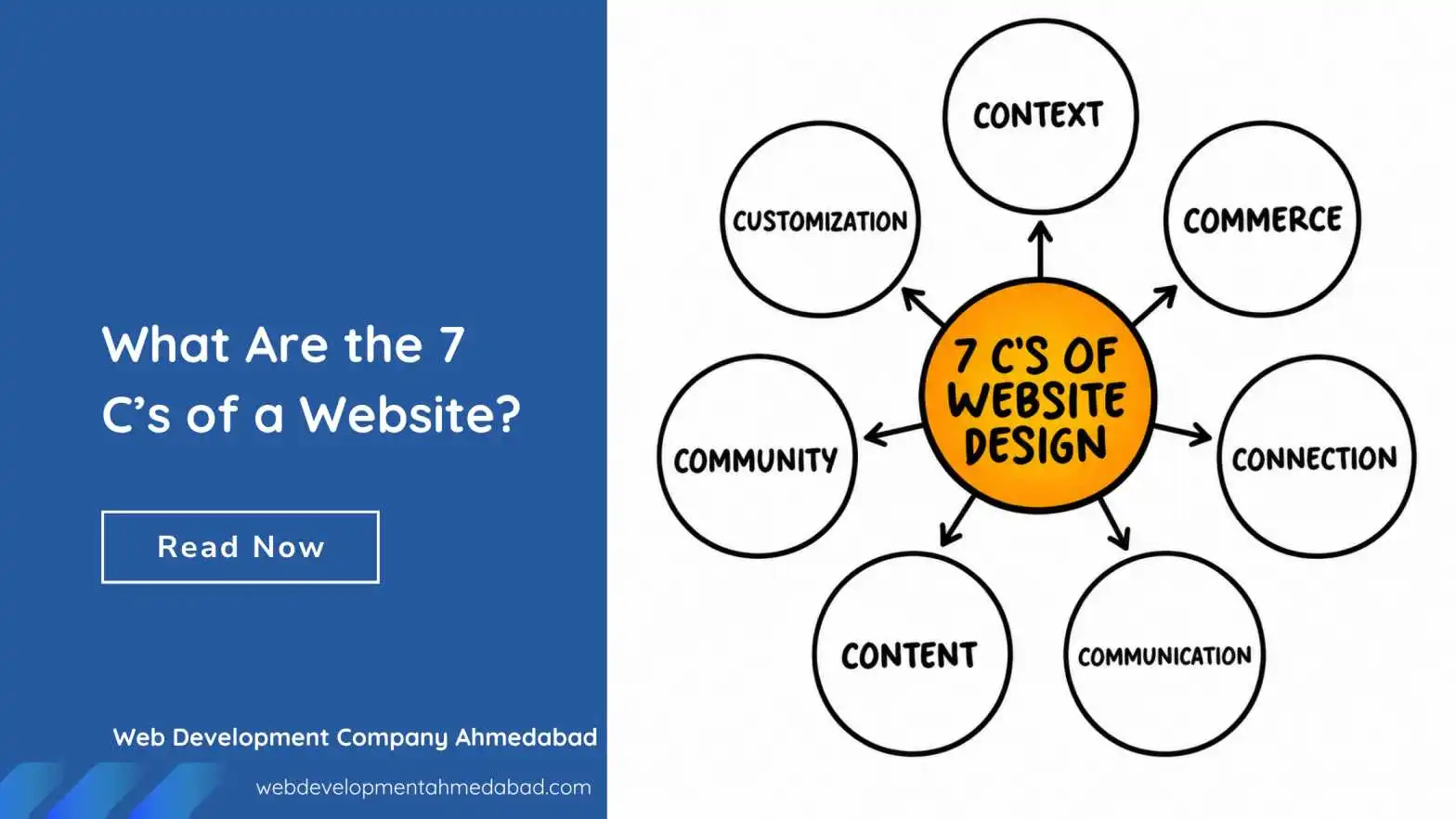
The websites that actually convert visitors into customers share common traits. These traits have been studied, named, and organized into a framework. People call them the 7 C’s of a website. Not a buzzword list. Not a fad. These are fundamentals that separate sites that work from sites that just exist.
Ignore them, and your website is quietly undoing every marketing dollar you spend. Get them right, and the same traffic suddenly starts producing results. Let’s walk through each one.
Context: The Visitor Needs to Know Where They Are
Context is about layout and design. It’s the visual structure that tells a brain “you’re in the right place” or “this feels off.” Before a single word is read, the visitor’s eyes scan the arrangement of elements on the page.
Think about walking into a physical store. You immediately understand the layout. Shoes are in one section. The checkout counter is visible. Signs hang where you need them. Nobody has to explain how to navigate. That’s context doing its job. A website with poor context feels like a warehouse with items thrown randomly on shelves and no aisle markings.
A clean layout isn’t about minimalism for the sake of trends. It’s about reducing the mental load. White space isn’t wasted space. It’s breathing room that lets the important elements stand out. When everything screams for attention, nothing gets heard. The headline should be obvious. The navigation should sit where people expect it. The call-to-action button should be impossible to miss.
Design consistency matters here too. If your homepage uses one font and your service page uses another, something feels broken. The visitor won’t consciously notice the font change. They’ll just feel a vague sense of unprofessionalism. That feeling is enough to make them leave. Context builds trust silently, through visual logic and predictability.
Content: Say What Matters, Then Stop Talking
Content is the information on your website. Words, images, videos, product descriptions. It’s what people came for. The trap most sites fall into is treating content like a dumping ground for everything the company wants to say. That’s backward. Content should answer what the visitor wants to know.
Someone lands on a plumbing website because their basement is flooding. They don’t care about the founder’s story. They need a phone number, a service area, and a reason to believe someone will show up fast. Content that serves the visitor first builds instant relevance. Content that serves the company ego builds bounce rates.
Good web content reads like a conversation, not a textbook. Short paragraphs. Active voice. Specific details instead of vague claims. Don’t say “we provide high-quality solutions.” Say “we fix burst pipes in under two hours, guaranteed.” One sentence actually means something. The other is just noise filling space.
Images and video matter enormously. A generic stock photo of a smiling call center agent screams “fake.” A real photo of your actual team, your actual truck, your actual work, builds immediate credibility. Visitors can smell stock photography the way animals sense fear. Use real visuals or don’t use visuals at all. Content isn’t just text. Every pixel on the page communicates something.
Community: People Want to See Other People
Humans are social creatures. We look for signals that others have been here before us and had a good experience. Community on a website means user-generated content, testimonials, reviews, comment sections, social proof. It’s the evidence that real people engage with your brand.
A testimonial page hidden in the navigation is community on life support. It barely counts. The strongest community signals appear naturally throughout the site. A product page with embedded reviews. A sidebar showing recent customer activity. A case study written as a genuine story, not a marketing puff piece. These elements say “people like you chose us and this is what happened.”
Community also means giving visitors a way to contribute. A blog with comments turned off is a monologue. A social media feed embedded on the site shows ongoing conversation. Even something as simple as displaying a counter of customers served or projects completed taps into the same psychology. Numbers suggest a crowd. A crowd suggests safety in choosing you.
Don’t fabricate this. Fake reviews are easy to spot and destroy trust permanently. If you have zero reviews right now, start with detailed case studies you write with permission from real clients. Name them. Show their photos. Describe their actual problem and your actual solution. One genuine, specific story outweighs ten generic five-star blurbs that say “great service, would recommend.”
Customization: Make Them Feel Seen
Customization means tailoring the experience to the individual user. Not in a creepy surveillance way. In a helpful “we remember you” way. Amazon shows you products related to your browsing history. Netflix remembers where you stopped watching. These are extreme examples, but the principle scales down to small business websites too.
A returning visitor should see something slightly different than a first-time visitor. Maybe the homepage highlights a different case study. Maybe the contact form pre-fills their name if they’ve filled it before. Even small touches signal that the site is paying attention.
Customization also means letting users control their experience. A dark mode toggle. A font size adjustment. A language preference. These aren’t just accessibility features. They’re moments where the visitor says “this site respects how I want to consume information.” Most visitors won’t use these features, but seeing that they exist creates a subtle impression of quality and thoughtfulness.
On a practical level, customization can be as simple as segmenting your homepage. First-time visitors see an overview of services and a trust-building section. Returning visitors see a direct link to schedule a follow-up call. The technology behind this is simpler than most small businesses realize. Even basic cookie-based logic can power these experiences. Start small. Customize one element. Watch how engagement shifts.
Communication: Be Reachable Without Being Pushy
People have questions before they buy. If they can’t ask those questions easily, they leave and ask a competitor instead. Communication means all the ways a visitor can reach a real human or get answers without friction.
Live chat is powerful not because chatbots are amazing, but because the option exists. Even if the visitor never clicks it, seeing that little icon in the corner says “someone is available here.” It’s an insurance policy against abandoned decisions. The visitor thinks “if I get confused, I can just ask.” That confidence often prevents confusion from happening in the first place.
Contact forms should be short. Name, email, message. That’s it. Every additional required field reduces submissions. Asking for a phone number cuts conversions. Asking for a company name cuts more. If you genuinely need that information, make it optional and collect it after a conversation starts. The goal of the first interaction is to start a conversation, not to populate a CRM database.
Response time expectations must be clear. If your contact form says “we’ll get back to you” with no timeframe, that’s a leak in your funnel. Add a specific promise: “We reply within 4 business hours.” Then actually do it. Communication isn’t just providing channels. It’s setting expectations and then meeting them. Broken promises on response times do more brand damage than not offering the channel at all.
Connection: Don’t Just List Features. Build Bridges.
Connection is about the emotional layer between your site and the visitor. It’s the hardest C to define and the easiest to get wrong. Connection happens when someone reads your website and thinks “they actually get me.” Not “they’re trying to sell me something.”
This lives in your messaging. It’s the difference between saying “We offer 24/7 IT support” and saying “Your server crashed at 3 AM and you’re panicking. We answer the phone on the second ring, not an answering service.” One statement lists a feature. The other connects to an experience. Connection is empathy demonstrated through specific, vivid language.
Tone of voice builds connection over consistency. A website that sounds formal and stiff creates distance. A website that sounds like a knowledgeable friend creates closeness. This doesn’t mean being unprofessional. It means writing the way you’d actually speak to a client across a table. Jargon breaks connection. Analogies build it. Statistics inform. Stories connect.
Visuals play a role here too. A photo of your team laughing during a project setup creates more connection than a posed, stiff corporate portrait. Behind-the-scenes content, mistakes you’ve learned from, honest explanations of your process. All of these invite the visitor into your world instead of keeping them at a transactional distance. People buy from people they feel connected to, not from logos.
Commerce: Make Paying as Painless as Possible
If you sell something online, commerce is the transactional experience. The shopping cart, the checkout flow, the payment processing. Even if you don’t sell directly on your site, commerce applies to any conversion action: booking a consultation, scheduling a service, requesting a quote. Commerce is the moment commitment becomes action.
Friction kills commerce. Every click, every form field, every page load between “I want this” and “I’ve bought this” costs you a percentage of customers. A three-step checkout where two steps would work is a leaky bucket. Requiring account creation before purchase is an ancient mistake that somehow still exists. Guest checkout must be available. Payment options should be obvious and varied.
Shipping costs that appear only at the final step are betrayal in pricing form. The visitor has mentally committed to the purchase. Then a surprise fee appears. Some pay anyway but remember the negative feeling. Many abandon and never return. Disclose costs early. Show shipping estimates on the product page. Over-communicate about delivery timelines. Commerce is about removing uncertainty.
For service businesses, commerce is the booking flow. A calendar that shows real availability and lets the prospect self-schedule is infinitely better than a form that says “tell us three times that work for you and we’ll confirm.” That back-and-forth costs you the sale. When someone is ready to commit, capture the commitment immediately. Tools like Calendly exist for exactly this reason. Use them.
Trust signals during commerce are non-negotiable. Security badges, guarantees, return policies, payment logos. Not in fine print at the bottom. Visible near the purchase button. The most anxious moment in any online interaction is the moment money leaves the account. Surround that moment with as much reassurance as possible. A simple “secure checkout” badge next to the button increases conversions measurably.
Conclusion: Putting the 7 C’s Together
Here’s what most people get wrong. They treat these seven elements as a checklist to complete one at a time. Context done. Content done. Moving on. That approach misses the point entirely. These C’s are interconnected. Weakness in one seeps into the others.
A beautifully designed site with garbage content is still a bad site. Strong content with zero connection reads like a robot wrote it. Great commerce flows that nobody reaches because the navigation is confusing solve nothing. The C’s reinforce each other. Good context makes content easier to consume. Connection makes commerce feel safer. Community strengthens connection by providing third-party validation.
Audit your site through each lens, honestly. Open your homepage right now. Don’t look at it as the person who built it. Look at it as a stranger who just landed there from a Google search for the service you offer. Does the context immediately establish where they are? Is the content answering their question or your marketing wishlist? Is there any evidence of community? Can they communicate with you instantly? Do they feel connected or pitched to? Can they take action without friction?
Most sites fail three or four of these tests. The good news is that fixing them isn’t a massive redesign project. Sometimes it’s rewriting one headline to actually answer a question instead of stating a vague value proposition. Sometimes it’s adding a chatbot widget. Sometimes it’s removing three form fields. Small changes to the right C create disproportionate results.
Start with the one that’s hurting most. For some, it’s content that’s all about the company and nothing about the customer. For others, it’s a checkout flow from 2009. Fix the biggest leak first. Then move to the next.
Gradually, the site shifts from a passive brochure to an active business asset that works while you sleep. That’s the whole point. A website should earn its keep, not just exist. The 7 C’s show you exactly where to start. Skip the guesswork. Let a web design and development company that understands user behavior handle your site from scratch.